DSC_0063.jpg

Flying Visits

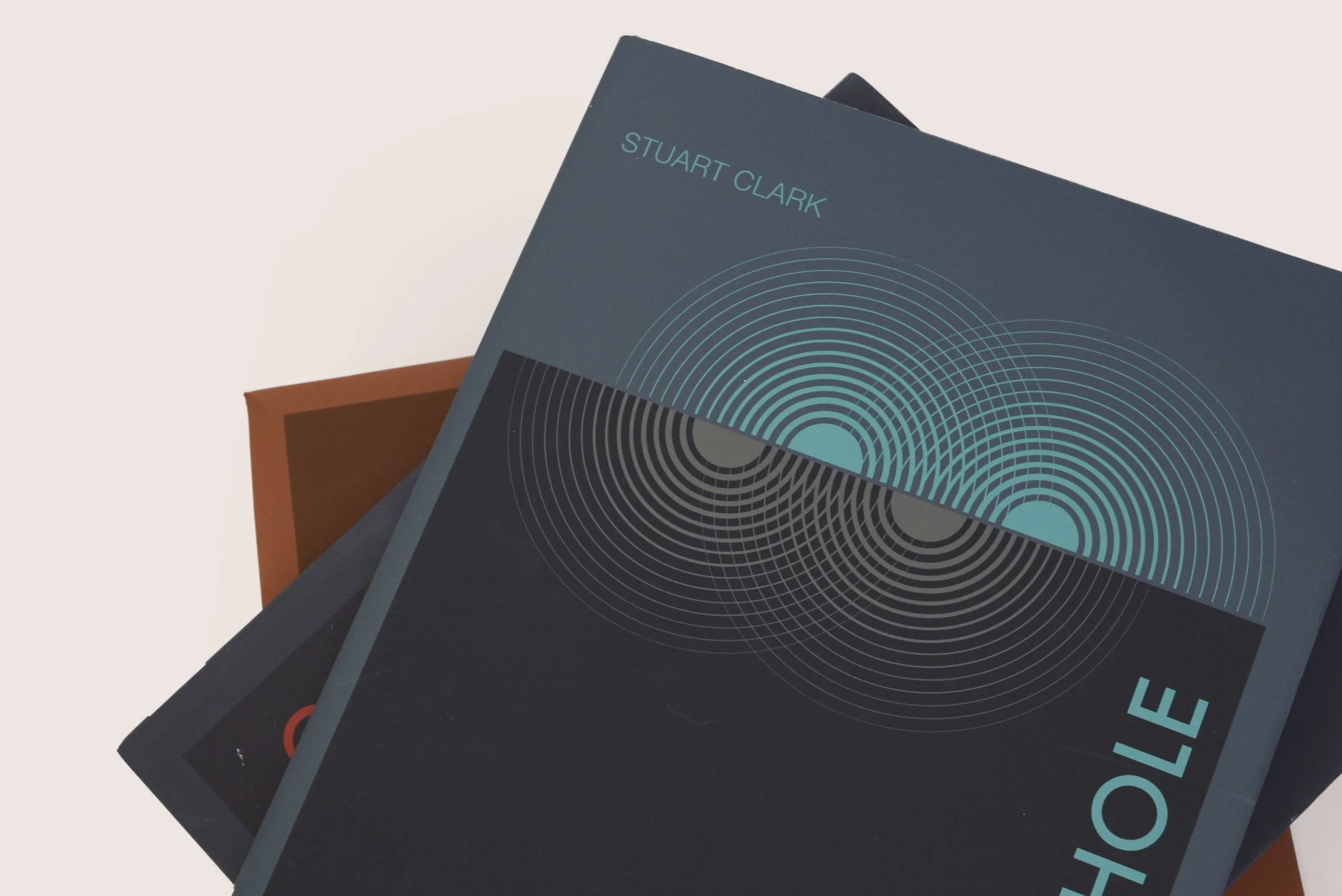
For an advanced typography course we were challenged to create a system for three or more, fictional (or real), books in a series. For this series I choose to use three typefaces. Futura, was chosen as the title and number face. Light halvetica, for headers and the author’s name, as well as the copy write. Finally, Garamond was chosen for the body text and quotes. I chose Futura first, as for a series of space education books; I figured it was an obvious choice. With the sharp clean lines and minimalist lack of emotion, it felt factual and futuristic as its namesake obviously suggests. Each book has a minimal illustration that alludes to the contents of the volume. I arrived at these illustrations while looking through retro images and drawings from the space age. I then began drawing basic shapes and repeating them. While sketching I began to become interested with the idea that many objects in space are circular and always tend to be of that sort of shape, so I narrowed my focus on using basic circles to create each illustration. The Black Hole illustration was my first conclusion for this series, and the Planets illustration followed soon after. With the Galaxy illustration I struggled to find a comprehensive way to show that element without repeating what I had come to for Black Hole, but I soon came to the conclusion of rings, inspired by the paths the planet’s orbit takes around a star or gravity pull.  Colors chosen for this series were also based off of the retro illustrations I had pulled from earlier in my research, dark unsaturated base colors, with bright pops really set off the type and made each book unique to itself.


FLYING VISITS: Book Cover Series

DSC_0063.jpg

For an advanced typography course, we were challenged to create a system for three or more fictional (or real) books in a series. For this series, I chose to use three typefaces: Futura was chosen as the title and number face; Light Helvetica, for headers and the author’s name, as well as the copyright; Finally, Garamond was chosen for the body text and quotes. I chose Futura first. Since this project was for a series of space education books, I felt it was an obvious choice. With the sharp clean lines and minimalist lack of emotion, it felt factual and futuristic - as its namesake obviously suggests. Each book has a minimal cover illustration that alludes to the contents of the volume. I arrived at these illustrations while looking through retro images and drawings from the Space Age. I then began drawing basic shapes and repeating them. While sketching I realized that many objects in space are circular and always tend to be of that sort of shape, so I narrowed my focus to using basic circles to create each illustration. The Black Hole illustration was my first conclusion for this series, and the Planets illustration followed soon thereafter. With the Galaxy illustration, I struggled to find a comprehensive way to show that element without repeating what I had come to for Black Hole. , but However, I soon came to the conclusion of rings, inspired by the paths the planet’s orbit takes around a star or the concept of gravitational pull.  Colors chosen for this series were also based on the retro illustrations I had pulled from earlier in my research: dark unsaturated base colors, with bright pops which really set off the type and made each book unique unto itself.
Blackhole_mockup.jpg
galaxies_mockup.jpg
planets_mockup.jpg
DSC_0073.jpg
DSC_0076.jpg
DSC_0058.jpg
DSC_0068.jpg