Magazine spread5.jpg

PIAFFE

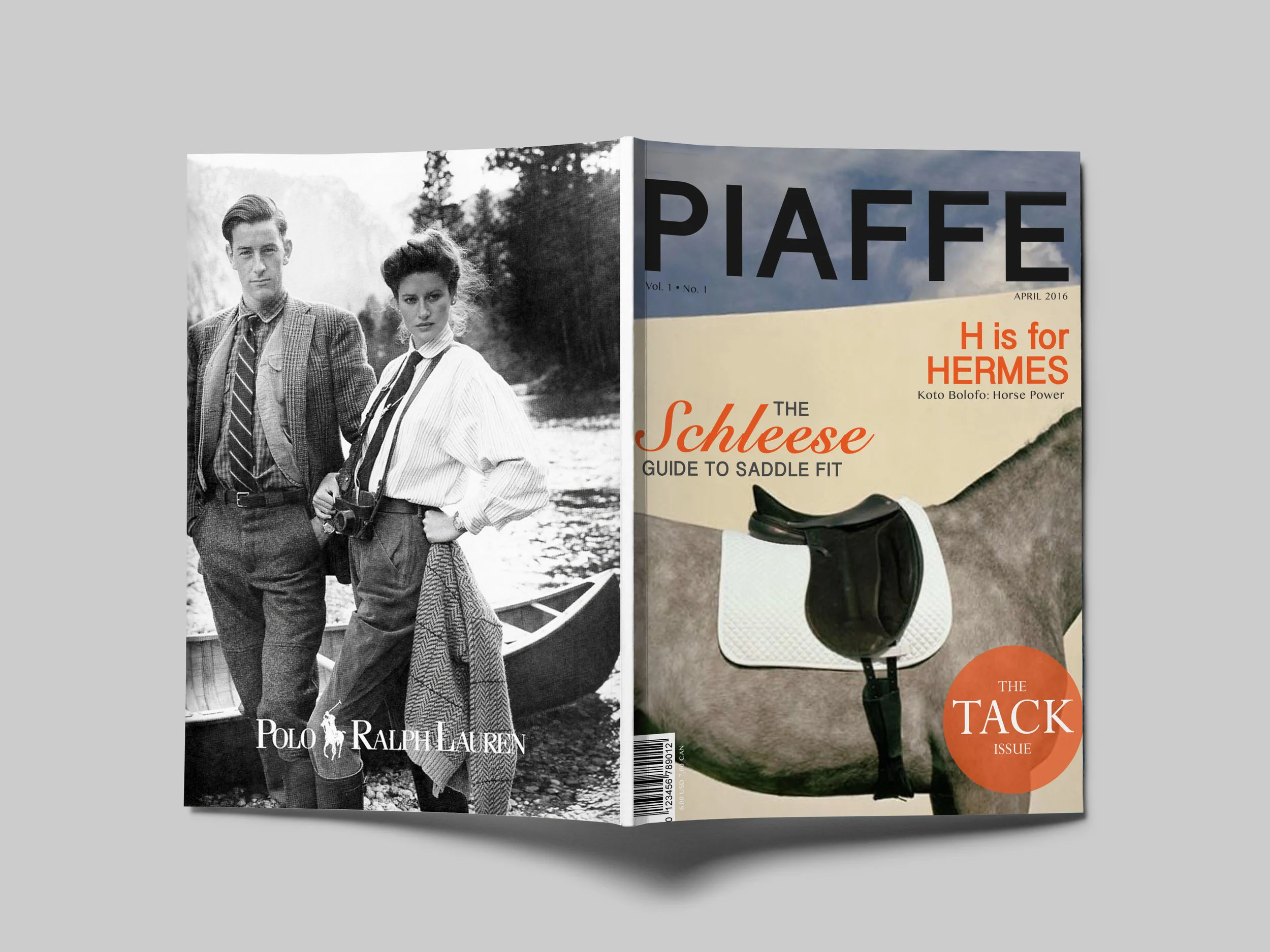
In my first studio course we were challenged to create a fictional magazine and two issue covers with opening spreads for the cover article. The magazine I created is a luxury equestrian magazine that focuses mostly on fashion, as well as art, leather goods, and tack equipment. In the early stages of research we were asked to look at advertisements of companies that may want to buy space in the magazine. I chose companies such as, Ralph Lauren, Range Rover, Rolex, and of course, Hermes.  I was so inspired by the equestrian related Hermes advertisements that I really wanted to imitate that aesthetic throughout the first issue. Using photography by Koto Bolofo, one of Hermes’ only behind the scenes and equestrian photographers, I created the cover. Using an orange similar to that of the Hermes Orange, just to make the article titles pop, and an accenting white and black combination of typography, to keep the titles minimal. What I was left with was three sets of typography that could stand alone, but also work together on the cover. Inside the issue the H is For HERMES spread is backed by more of Bolofo’s photography mirrored to make an abstract H with the portrait of the horse. Overlaid is the title, which crosses over both pages in the same orange used in the cover. The subtitle sits in the space created by the right horse’s lead, framing it while it lines with the R above it. In the second cover I continues my system I had created with the first, creating minimal titles that worked together, but could work alone. The second spread, is not as bold and artistic as the first, but that is because it is not about art, but more about a connection between man and beast. All focus is shifted to the left at the horse’s calm, caring expression, and how he is apart of the team, and it is not just humans that participate in this sport. 


PIAFFE: Equestrian Magazine

Magazine cover4.jpg

In my first studio course, we were challenged to create a fictional magazine and two issue covers with opening spreads for the cover article. The magazine I created is a luxury equestrian magazine that focuses mostly on fashion, as well as art, leather good and tack equipment. In the early stages of research, we were asked to look at advertisements of for companies that would potentially buy advertisement space in the magazine. I chose companies such as Ralph Lauren, Range Rover, Rolex and of course, Hermes.  I was so inspired by the equestrian-related Hermes advertisements that I really wanted to imitate that aesthetic throughout the first issue. I created the cover using photography by Koto Bolofo, one of Hermes’ only behind-the-scenes and equestrian photographers. I used Using an orange color which was similar to that of the Hermes Orange, just to make the article titles pop, and I selected an accenting white and black combination of typography, to keep the titles minimalistic. What was left were three sets of typography that could stand alone, but also work together on the cover. Inside the issue the H is For HERMES spread is backed by more of Bolofo’s photography mirrored to make an abstract H with the portrait of the horse. Overlaid is the title, which crosses over both pages in the same orange used in the cover. The subtitle sits in the space created by the right horse’s lead, framing it while aligns with the R above it. In the second cover, I continued the system I had created with the first, creating minimalistic titles that worked together, but could work alone. The second spread is not as bold and artistic as the first, but that is because it is not about art, but more about a connection between man and beast. All focus is shifted to the left onto the horse’s calm, caring expression, and how he is a part of the team, providing a reminder that it is not just humans who participate in this sport.
DSC_0135.jpg
Magazine spread2.jpg
DSC_0064.jpg
Magazine cover3.jpg