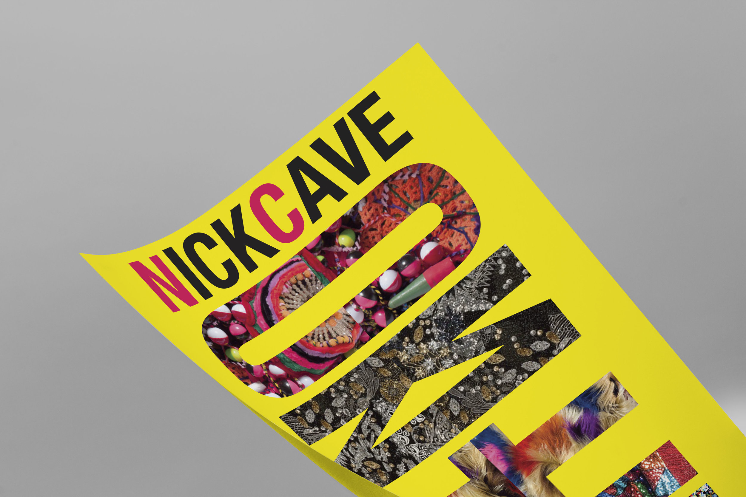
NICK CAVE: Exposition Poster
This project was to create a poster for an artist show, display, performance, or exposition, while also using inspiration from that specific artist’s work. For this assignment, I chose Nick Cave’s show UNTIL, that was currently showing at the Massachusetts Museum of Modern Art. I began by pulling textures and color from his projects, such as his famous sound suits and beaded wall hangings. Using these textures, I then masked them onto the tile UNTIL, that is featured in the center of the poster. Originally the word UNTIL was vertical by itself, but after watching Nick Cave’s art film “Drive By” I decided to pull the reflection element into the poster, as it was used in the film to abstract the sound suits and textures. Originally the reflected letters were slightly offset from each other, but after a revision they are now perfectly aligned, and instead, to show separation, the patterns are offset. The large NICK CAVE across the top of the poster is bold and clean with the first letter of each word being a shade of hot pink to provide for word differentiation and clarity. Details of the event are towards the bottom of the poster, and are framed by the L’s in the UNTIL composition. Finally, the hot yellow background ties the whole poster together and stays on brand with Nick Cave’s previously printed materials for shows, while pulling out all the colors within the patterns and making them cohesive. Overall, I really enjoyed my process and research on this poster, and as Nick Cave is one of my favorite fine artists, I truly enjoyed pulling inspiration from him for this piece.


